Colors for Peace
Client:
Colors for Peace
Year:
2021
Category:
Charity Organization
Services:
Brand Identity, Brand Strategy,
Digital Advertising, Digital Strategy,
Digital Communication, Web Communication, Social Media Management
Colors for Peace is a non-profit association that promotes children’s art internationally to to shape the Adults of Tomorrow and Inspire the Adults of Today in the Universal Culture of Peace, through art, hope, and solidarity.
The association has gathered the largest collection of children's art in the world and is currently involved in humanitarian projects to help war refugees.
The Challenge
Our challenge was to completely transform Colors for Peace from a local Italian non-profit association to an international reality.
The growing structure of Colors for Peace, expanding in – among the others – South America and East Europe – showed the need of a flexible identity that could be translated in many languages and many types of usages, from the web to the print.


The Identity
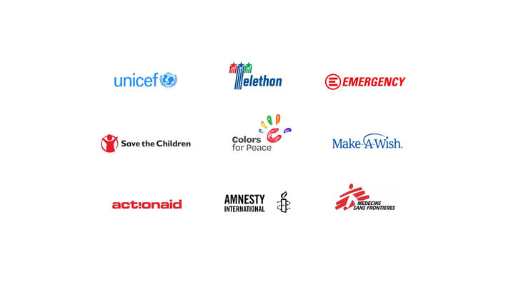
We created a design system based on the powerful trademark of a children's open hand made out of paint. The logo, made of a C – initial of the naming – at the center of an explosion of colors, can be virtually recreated by every kid with their own hands.
The symbol, at the early stage of the project, was meant to be used together with a localized naming for every language, but in the end the Association decided to promote the only international naming "Colors for Peace" worldwide.
The symbol, for its purity and joyfulness, entered immediately the culture of the association and was well received by organizers, ambassadors and kids.
After the start of a collaboration with a notorious medical company, the trademark became the symbol also of a cycling team and was repeatedly applied on the banners of one of the most famous stadiums of Serie A, the major Italian football league.


The Impact
The design system we created for Colors for Peace had a positive and lasting impact on the association and its mission. The logo, with its simple and colorful expression of peace, became a recognizable and memorable sign of the association’s values and activities. It also helped to create a sense of belonging and identity among the organizers, ambassadors, and kids who participated in the project.
The logo also attracted the attention and support of various partners and sponsors, who helped to spread the message of peace and solidarity through different channels and platforms. The logo was seen by millions of people around the world, who were inspired by the association’s vision and goals.
The design system we created for Colors for Peace was more than just a visual identity. It was a powerful tool to communicate and promote a noble cause that touched many hearts and minds.


Creative Team
Creative Director:
Daniel Salvi
Art Direction:
Luca Rivieri


